Outside In – Paint Color ‘au Naturel’
Paint color inspirations derived from nature: Mother Nature’s palette
In my color and lighting consultation work, I am constantly running across color palettes that are inspired by the natural world. These are mostly color schemes derived from photographs of nature, and with the eye-dropper in Photoshop, it’s easy to click on a beloved tone and come up with the RGB or CMYK numerical value.
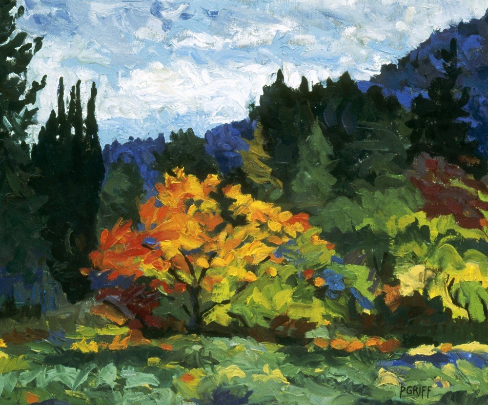
Loving color as a kid growing up in the northwest, I adored drawing and painting pictures of things in nature. I discovered “plein air” painting for the first time when I was eight years old at summer camp when I colored a picture while watching a bird in her nest.
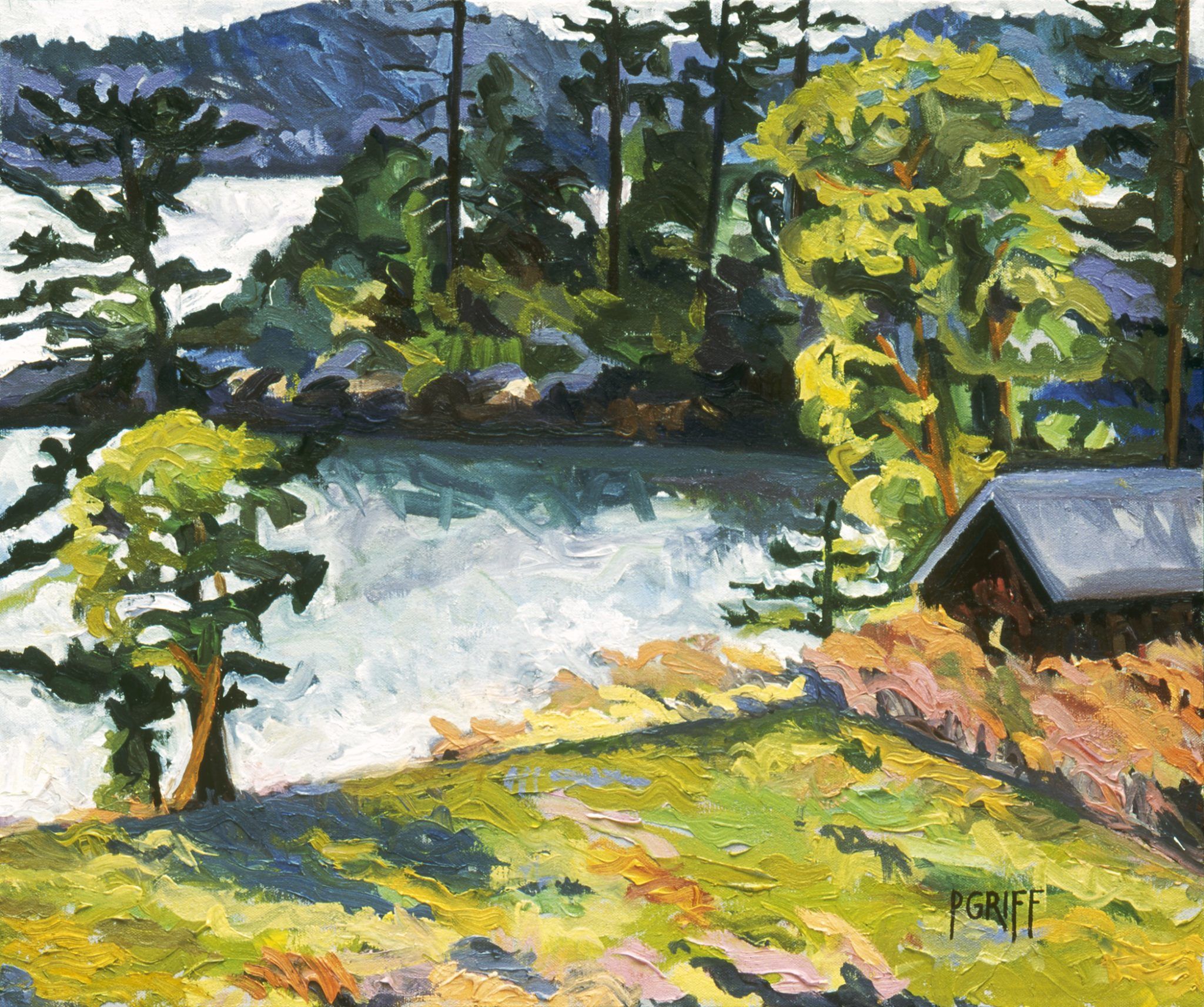
As a landscape artist, my inspiration continues to draw directly from nature, as is the case with many painters throughout history. Though I do often use paint manufacturer’s color collections such as Benjamin Moore or Sherwin Williams, it is with the experience of how colors operate within the natural world that has allowed me to achieve terrific results and in the end, client satisfaction.
To stand before nature herself and mix the colors as they are seen, is a wonderful experience, and when a client’s budget allows, this is ideal. When someone says to me, “I love the color of the underside of an apple leaf”, I like to say, let’s find an apple tree and make that color!” If the blue-green color of Puget Sound on a day when the wind is stirring up silt inspires someone, then we find that color and create it.
Translating these precise tones into wall paint, and then applying them on the walls of a room is the thrill of bringing what is outside in, and provides the color harmony, parallel to nature, that provides for comfortable living. When mixing my own colors, I use an oversize palette that makes for plenty of mixing space in the center. Along with that, are my essential artist’s pigments squeezed out in ample amounts, around the perimeter.
My basic pigment recipe for color mixing is as follows: Titanium White, Viridian Green, Sap Green, Ultramarine Blue, Cobalt Blue, Burnt Umber, Burnt Sienna, Raw Umber, Raw Sienna, Alizarin Crimson, Cadmium Red, Cadmium Yellow, Naples Yellow, (and Zinc White and Vermillion are optional). Add in a perfectly weighted palette knife, and some fundamental knowledge of how complementary colors operate within nature, I can create any tone in both the rainbow and nature combined!
While digital formulas have their place, I have found pals behind the counter at the paint store willing to work from my large, nature-derived paint samples. They have let me oversee the ‘mix’ and eventually, when it came to rolling out the paint on the walls, we knew that they had been keenly perceived in Mother Nature herself. What could be better?
Northwest Landscapes by Paula Griff McHugh


